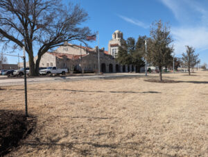
 Yesterday’s ride took me past some places that caught my eye. To be more exact, the views called my name and I tried to capture them. One of the things I do is look for scenes that can be used as blog headers or banners. This building is the old Santa Fe Railroad Station in OKC. There are no longer any tracks near this thing, but the building was worth preservation and is now a museum, so it gets some love and remains quite lovely.
You’ll see this again, but from different angles, because one of the things that my mind searches for is scenery that can be cropped as blog headers or banners. I share them with anyone who asks. The only trick is to be able to envision what the scene would look like in a narrow horizontal tableau.
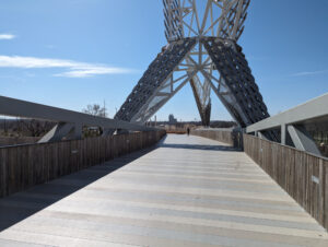 Any of these images could be cropped that way, but sometimes you have to get the angle just right. This is the Scissortail Bridge over Interstate 40 in Oklahoma City. The Scissortail Flycatcher is our state bird, so it naturally shows up in art across the state, though here it’s highly abstracted. The intent was to catch drivers’ imagination as they pass through the city on the highway system.
The city is learning; every art installation has been vandalized to some degree, and the department in charge of this stuff has to recognize ways to reduce the temptation, to make the target harder for vandals. This bridge had already been modified from its original design. Some public works are more vulnerable than others.
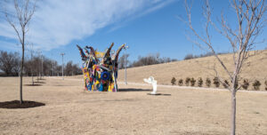 The honest truth is that public art fixtures like this one could be vandalized some and you’d never know it. I suppose someone could set fire to it, but that’s risky, since the thing is lit up all night long and police do patrol this area. It’s highly visible from long distance in most directions.
Otherwise, it’s the kind of quirky stuff that has grown popular around here. It’s been a very long time since Oklahoma City has seen an investment in classical style artwork. These days the taxpayers are getting oddball stuff that, in the balance, is probably about right for the tastes of younger generations.
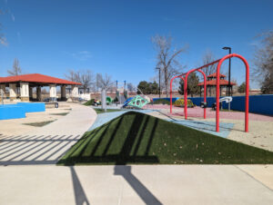 Playground equipment is also touched by this trend. Gone are the old standards of previous generations; most newer playground look like this one in Manuel Perez Park, along the south bank of the Oklahoma River Recreation Area. This time, I did what I could to hide the vandalism, but this scene served up another banner shot by moving to a different angle.
If you take enough pictures and look them over, learn about cropping and so forth, you start to get a feel for what will turn out and what won’t. I still make mistakes and have to toss pictures, but I feel like I’m getting better at capturing. And the honest truth is that cellphones and tablets have made it so much easier for me. I’m not that interested in shots that require very much zoom. That’s not my thing. I’m much more interested in stuff that simply decorates, something that speaks wordlessly, without out specific impressions being generated.
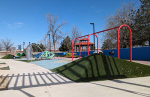 This is the same playground from a different angle. If you wanted to use this in a banner image, it would be relatively easy to use the cropping function built into most blogging software to capture a fine color spread. It would capture that kind of decoration that doesn’t have any particular meaning, just something that generally pleases the eye.
As always, my photographs are offered under the Creative Commons Share Alike license; no attribution is required.


Classical art and what we could call “pop” art seem to serve different purposes. Classical art is a better medium to maintain and connect to tradition, where pop art has more a more individual, mundane personality to it. I prefer the classical side more so since it makes me ponder on some things I normally wouldn’t, but some pop art is appealing because it can carry local character well.